Posts

Final Project: Education, Longevity, and Population Density within the State of California

Image
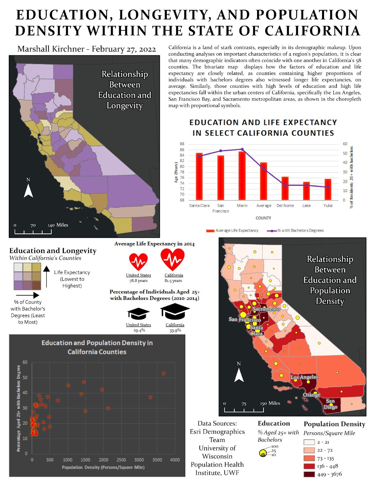
For my final project, I chose to explore the variables of population, life expectancy, and education within the state of California. The CSV file from the Health Rankings & Roadmaps website was downloaded and then uploaded as a table to my ArcGIS Pro project. Within this project, I also uploaded the Esri sourced data on education levels within counties. Since the FIPS fields of these layers did not match, I used the Field Calculator to adjust the Health Rankings & Roadmaps county FIPS so they would all have a leading ‘0.’ Doing so allowed me to join these layers and have all of my county attributes in one singular feature layer. I then symbolized the education and life expectancy layers to consist of three quantile data classes, which allowed me to obtain the values that I would use to assign classes. The classes were then assigned to a newly created field within the attribute table, and then these fields were combined to one final field using the Calculate Field tool. This fi

Module 6 - Proportional Symbol and Bivariate Choropleth Mapping

Image
The final module of Communicating GIS course involved using proportional symbols and bivariate choropleth on maps to represent different types of data. I find that these map types are excellent at showing common trends and symbolizing data in a unique way. This lab began with using proportional symbols to represent different Indian cities' populations. As recommended in the lab instructions, I opted to use a darker background for the country of India, and a light, bright colored symbol for the cities. This symbol was pink and had a high level of saturation. I opted to use a yellow outline for the city symbols, as this helped them contrast even further with the dark blue background. For the size, I chose a minimum of 5 points and maximum of 40, as I found this combination reduced many points of overlap while still representing the data appropriately. For my legend, I used the nested circle legend design. This allowed for me to show the proportional symbols, while saving space and al

Module 5 - Analytical Data

Image
 The focus of this week's laboratory assignment was on numeric, tabular data. Luckily, ArcGIS Pro and Microsoft Excel are excellent in data visualization which allows for informed analysis of important topics. This week, I was tasked with determining two a relationship between two variables from the County Health Data posted by the University of Wisconsin. I selected a more obscure relationship with a profound correlation. The selected variables were the Food Environment Index and impoverished children. The Food Environment Index was determined for each county in the United States, and consists of a ranking 0-10, with 0 being the wort in terms of access to health foods and 10 being the best. The impoverished children statistic was normalized for each county and represented as a percentage of the total number of children in the county. These statistics were then used to create meaningful graphs and maps that outline their unique correlation.  I chose to utilize Microsoft Excel to cr

Module 4 - Color Concepts and Choropleth Mapping

Image
While easily overlooked, color choices and data classification schemes are instrumental in constructing accurate and appropriate maps. This laboratory assignment highlighted how color selections impact a map's overall legibility and message to the viewer. Adjusting colors to meet the needs of an array of audiences, such as those who are visually impaired or even color blind is also very important to take into account when creating a map. Throughout this post I will highlight the different color ramps and maps that I created during this fourth lab in Communications in GIS. I began the assignment by manually creating two color ramps - linear and adjusted. These ramps were constructed using various RGB values within the ArcGIS Pro 'Color Properties' option. I used different formulas and patterns to determine what RGB values to use, such as using a 33% increase in the interval between the darkest and next darkest and 33% less interval between the lightest and next lightest for

Module 3 - Terrain Visualization

Image
This week's laboratory assignment was based on terrain and elevation data, and how to best display and communicate it using the tools and capabilities within ArcGIS Pro. From contours, to hillside, to 3D modeling, there are a variety of ways in which one may display varying topography. I often referenced the two readings assigned this week throughout this lab assignment, as the authors provided excellent insight on the types of visualization I would be working with.  Firstly, I was tasked with creating and labeling contour lines on a DEM located in Jackson County, Oregon. I enjoyed creating the contours and labels to make sense to the viewer. Using the mask tool was instrumental in allowing the elevations to be placed within the contour line and not having them cover any of the lines, rather them be placed inside the lines. For my final map layout, I chose to utilize natural elevation symbology (greens to reds) and I adjusted the labels so that they would be visible in this zoomed-

Module 2 - Coordinate Systems

Image
Utilizing the correct coordinate systems and projections is a crucial skill in creating accurate maps that reduce deformities and portray the globe's true properties. This laboratory assignment involved creating a variety of maps, selecting the best coordinate systems / projections, and analyzing the impacts of deformities on a map due to projections. I chose to assess the state of Vermont as my area of interest. The coordinate system I chose to implement for Vermont was NAD 1983 (2011) StatePlane Vermont FIPS 4400, because this system proved to be the most accurate and resulted in the least distortion for the map area. The other options available were less appropriate because State Planes are the most accurate, compared to UTM and other projections, as they are tailored to their specific states. Since the state of Vermont only lies in one state plane, this meant that it was appropriate to use the State Plane projection. I was tasked with altering projections on a world map and ass

Module 1 - Map Design and Typography

Image
This week's laboratory assignment emphasized the use of map design and typography to communicate messages and trends to map viewers. I particularly enjoyed this assignment, as I believe a map is useless if it is not communicating a clear message. The lecture for this week covered the five cartographic design principles: visual contrast, legibility, figure-ground organization, hierarchal organization, and balance. These principles are instrumental in creating effective maps. I will further assess how the maps I created this week satisfy these principles. The first part of this assignment was creating a tourist map for the city of Austin. This map was to emphasize elements of the area that tourists should be aware of, excluding live music. I utilized appropriate symbology to communicate the important map elements appropriately.  I chose to symbolize the Travis County layer with a black outline and light beige fill. This allowed for the other features to stand out. I symbolized the ro

Module 3.1 - Scale & Spatial Data Aggregation

Image
The final assignment of this course covered a multitude of important topics, mostly involving spatial data, its integrity, and how it may be manipulated to cater to differing narratives. Working through the assignment showed me how big of an impact scale can have on vector data. As seen in the images below, scale is directly related to resolution in that smaller scales have much higher resolutions. In other terms, the more one zooms out, the more generalized features will become. Thus, it is important to use the smaller scales when possible to show features accurately.  Comparing Flowlines at Varying Resolutions Comparing Waterbodies at Varying Resolutions Another important topic covered in this lab was gerrymandering. This is a term that is unfortunately very problematic for the United States, in that it often affects election results and so on. It essentially consists of lawmakers redrawing districts to tailor to their desires. The way in which one draws a district will inevitable im

Module 2.2 - Surface Interpolation

Image
In this week's laboratory module, I utilized a multitude of interpolation techniques to display water quality metrics within the Tampa Bay. Interpolation is used to connect known data points and fill in gaps that would otherwise contain no specific data. Whilst it is a useful method in creating meaningful maps, it is a technique that comes with its own challenges. I found that each interpolation method was substantially different from the next, with each having their own unique set of pros and cons. Interpolating data can be tricky, as it often generalizes areas in incorrect ways, and this is important to account for when using certain data and techniques.  The results were very surprising, especially seeing how differently the output would appear between different methods. In order to go about deciding which interpolation technique I would use in future projects, I would run a similar setup to this lab. I believe that assessing the statistics each method provides and analyzing th

Module 2.1 - TINs and DEMs

Image
This week's laboratory assignment covered the inputs, differences, and uses for DEMs (Digital Elevation Models) and TINS (Triangulated Irregular Networks). I often use these two topographical representations in projects and find them to both have their own pros and cons. This particular lab showcased that they are both fairly different and should be used based on what type of data is being shown and how it should be represented. I enjoyed learning about the differences between the two through a variety of spatial tools and analyses. Personalized TIN Symbology My analysis of TINS and DEMs proved to me that TINS are often superior to the standard DEM in many ways. TINS often do not generalize as much as DEMS, and showcase more data in areas that have higher densities of data. For example, the TINS generated contour lines were much more accurate and forming to the terrain present in part D of the assignment. TINS are generated from vector point data that contain x, y, and z coordinate

Module 1.3 - Data Quality: Assessment

Image
  Roadway Completeness Comparison This week's laboratory assignment concluded this course's focus on data quality, more specifically in data quality comparison and assessment. I particularly enjoyed this module, as I understand how critical data accuracy is and what it could mean in terms of analysis and change making. Minor differences in data quality could mean all the difference for decisions to be made on a particular matter. For this analysis, two sets of road networks were provided (both located in Jackson County, Oregon). Whilst they appear similar from a distance, there are many important differences that were highlighted in this analysis. From a bigger picture point of view, I determined that the TIGER 2000 road network is more complete, as it has a longer total length than the Street Centerlines network. Utilizing the Calculate Geometry tool, I determined the following total road network lengths:  Street Centerlines = 10,805.8 km TIGER Roads = 11,382.7 km Analysis Ste

Module 1.2 - Data Quality: Standards

Image
Data accuracy is imperative in conducting assessments and making appropriate conclusions on spatial data. I often find throughout my GIS assignments, data can be skewed and unreliable based on how and when it was acquired. Thus, implementing data quality standards is an excellent way to ensure one's data is accurate before creating projects or making analyses. Making accuracy assessments is a great way to determine if one should use certain data and if it will be reliable for particular assignments or projects. I will certainly be comparing data accuracy in future assignments in an effort to ensure my data is reliable and spatially accurate. City of Albuquerque Data StreetMap USA Data Orthophoto Imagery with Digitized Intersections For the purposes of this assignment, I utilized the Positional Accuracy Handbook by Minnesota Planning (1999) to conduct an accuracy assessment. The following steps were taken in performing this assessment: 1. Determine if the test involves horizontal ac