Final Project: Education, Longevity, and Population Density within the State of California
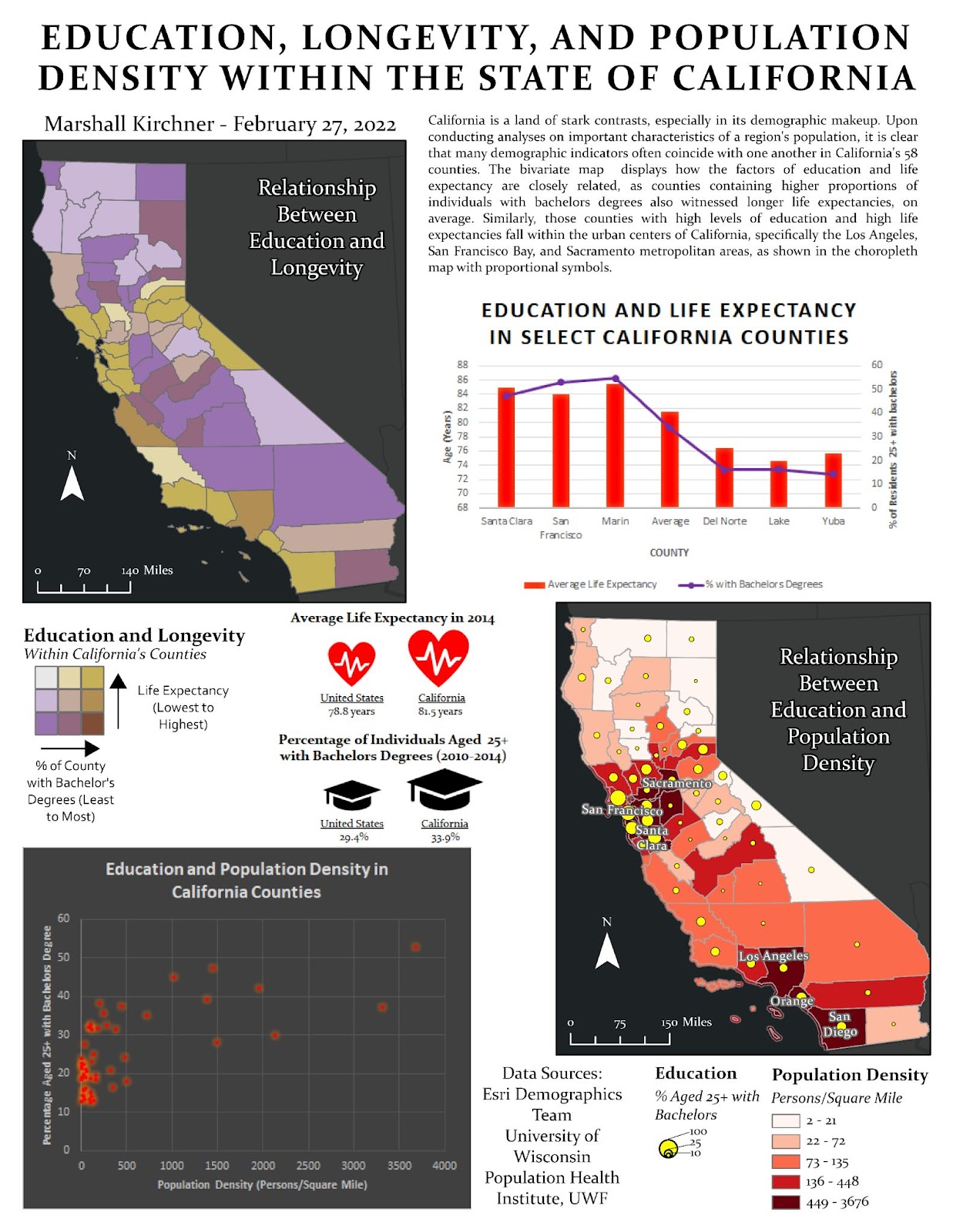
For my final project, I chose to explore the variables of population, life expectancy, and education within the state of California. The CSV file from the Health Rankings & Roadmaps website was downloaded and then uploaded as a table to my ArcGIS Pro project. Within this project, I also uploaded the Esri sourced data on education levels within counties. Since the FIPS fields of these layers did not match, I used the Field Calculator to adjust the Health Rankings & Roadmaps county FIPS so they would all have a leading ‘0.’ Doing so allowed me to join these layers and have all of my county attributes in one singular feature layer. I then symbolized the education and life expectancy layers to consist of three quantile data classes, which allowed me to obtain the values that I would use to assign classes. The classes were then assigned to a newly created field within the attribute table, and then these fields were combined to one final field using the Calculate Field tool. This field (‘CLASS_COMBINED’) was symbolized using the Unique Values option in the Symbology pane. I adjusted the color properties of the symbols using HSV values from ColorBrewer / Color Hex websites. This provided me with a color scheme that was useful in displaying the relationship between the two variables in a bivariate map with an appropriate legend. I manually created a legend similar to that in the Module 6 lab, which allowed me to show both variables and how they coincide with one another. For the other map present on the infographic, I chose to create a choropleth map of population densities with proportional symbols over the counties to represent education rates. Since there was no pre-populated field for population densities, I manually created one. Another field was also created and calculated using the Calculate Geometry tool to fill the shape area of each county. Then I used the Field Calculator tool to calculate the population density in the appropriate field (Population/Area). To symbolize this, I used a graduated color scheme of reds, ranging from light to dark, with darker colors indicating more densely populated counties. The proportional symbols were symbolized for the education rates using the proportional symbol classification method and I altered the minimum and maximum point sizes as necessary. To display the names of the most densely populated areas, I used an SQL query in the Labeling tab to display the names of the counties with more than 1500 individuals per square mile.
I utilized Microsoft Excel to create my data visualization and graphs, as it is easy to manipulate data and edit visuals on this platform. The scatterplot was created by selecting the appropriate fields from the raw data and ensuring the FIPS matched. I then used the ‘Insert’ and ‘Scatter Plot’ options to create the scatterplot. The appearance and axes were updated manually to best suit the needs and aesthetic of my infographic. I used a similar approach for the bar graph, only this time using two Y-axes to represent the different data units on each side of the graph. Lastly, a unique data visualization was created with heart and graduation cap icon sizes proportional to the California and overall United States averages.
The bivariate map shows that the variables of education and longevity are closely tied together, evidenced by the counties in light brown, dark purple and brown-purple mix. These counties are where the variables are most closely tied and have similar class values. I found that most counties in the state of California possessed one of these two colors. This indicates that education and longevity are correlated and counties with more educated residents also see residents living longer, on average. The proportional symbol map shows that the variables of education and population density are also closely related. The counties in the Los Angeles, San Francisco Bay, and Sacramento metropolitan areas witnessed the largest symbols, meaning they were the most educated. Rural areas with lower population densities (that are light red) witnessed smaller proportional symbols, meaning that less individuals in those counties possessed bachelor’s degrees. This is in line with the findings present in the webpage posted by the U.S. Department of Agriculture Economic Research Service, where urban counties have higher levels of educational attainment (2021).
Not only did the maps provide meaningful trends and relationships, but the created graphs and visualizations did also. The bar graph displaying data regarding education and life expectancy provided an excellent look at how these two variables often tie together. Three counties that all experienced longer life expectancies than most other California counties (Santa Clara, San Francisco, and Marin counties) also witnessed high levels of education among its residents, as indicated by the trend line in purple. Similarly, three counties that experience lower life expectancies (Del Norte, Lake, and Yuba counties) witnessed smaller percentages of individuals with bachelor's degrees. These results show that the variables of life expectancy and education are directly correlated. The scatterplot was created to display trends between education levels and population densities in California’s 58 counties, with one variable on each axis. The points on the graph indicate each county and display a general positive correlation. As population density increases, the percentage of residents holding bachelor’s degrees also increases. Lastly, the data visualization in the center of the infographic displays important statistics and icons to represent these statistics. It was found that California residents typically have longer life expectancies compared to the United States average (81.5 years and 78.8 years, respectively). Similarly, California residents are often more educated, with 33.9% of residents 25+ holding a bachelor's degree, compared to the U.S. average of only 29.9%.
All in, the analysis conducted on this state leveraged important knowledge and findings that indicate the demographic nature of California residents. California is a widely varied state, in terms of geography, demographics, and so forth. Conducting analyses on publicly available data shows important trends and characteristics. Succeeding the creation of the analytical maps and charts, it became clear that there is a definitive correlation among the three demographic variables chosen. I found that those that are educated tend to live longer, and those that live in urban areas tend to be more educated. These findings are relevant as they provide insight into how counties within California relate to one another. This is certainly not a blanket conclusion to the entire country, or even to that of the state of California, but rather a notable trend that could be used for a plethora of decisions and policies.
One prominent limitation that hindered the overall analysis was the timeliness of the data. I came to realize that both datasets were for 2014, however I am sure that the figures have changed to some degree since 2014. Utilizing more timely data would result in a more accurate depiction of longevity, education rates, and population densities. This project made it clear that finding the most up-to-date data is crucial in providing a timely and meaningful analysis. Another limitation that arose during my analysis was the population density not being attributed to the feature layers. However, the population counts were a field, so I chose to resolve this manually. A field for the county area was created and calculated using the Calculate Geometry tool. Then I calculated another field using SQL to represent the population density to be used for further analysis (Persons/County_Area). This simple, but effective approach proved to be worthwhile in terms of my analysis. If I were to only assess population figures, this would provide a very inaccurate depiction of a county’s demographics. Normalizing data is important, as larger counties will often have more residents than counties that are smaller. However, population density will account for both of these factors and showcase the data in a more meaningful manner.