The focus of this week's laboratory assignment was on numeric, tabular data. Luckily, ArcGIS Pro and Microsoft Excel are excellent in data visualization which allows for informed analysis of important topics. This week, I was tasked with determining two a relationship between two variables from the County Health Data posted by the University of Wisconsin. I selected a more obscure relationship with a profound correlation. The selected variables were the Food Environment Index and impoverished children. The Food Environment Index was determined for each county in the United States, and consists of a ranking 0-10, with 0 being the wort in terms of access to health foods and 10 being the best. The impoverished children statistic was normalized for each county and represented as a percentage of the total number of children in the county. These statistics were then used to create meaningful graphs and maps that outline their unique correlation.
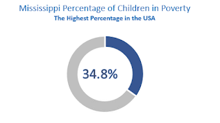
I chose to utilize Microsoft Excel to create my scatterplot, since this is the program I am most comfortable with regarding data visualization. I included an X and Y axis that described what each axis is referring to. For the points, I used the dynamic visualization option that lightly highlighted the border of the points so one may better see which point is which. Lastly, a title was placed that describes the scatterplot and it was resized to best show the trend between the two variables. For my bar charts, I chose to utilize the same color scheme as the scatter plot for consistency’s sake. I included the three highest values, three lowest values, and U.S. average for the Food Environment Index Chart. For the Children in Poverty chart, I used the same counties and their values from the % of children in poverty field. Then I ordered the counties by value and adjusted the charts’ axes and scales as necessary. I used horizontal labels to improve readability (Oetting, 2018). Lastly, I found it helpful to include the values next to their respective bars, so the reader may have the number in case they have trouble visualizing the graph. I chose to keep a simple, yet effective design for my visualization techniques. First, I implemented a pie chart that shows the percentage of children in Mississippi living in poverty. This statistic was both alarming yet powerful and I believed the pie chart would be excellent at capturing it. The area in blue is the portion of the whole (total children in Mississippi) that are living in poverty. The second image I created was again, simple but effective. I stuck with the color theme and placed a blue person icon to represent a child living in poverty. The statistic is again powerful and important for the overall message of the infographic.