Module 6 - Hazards: Damage Assessment
Link to Storymap:
This final module of the course was an excellent, all-encompassing project in which we were able to expand upon the analyses made in the previous module and map the damage from the storm itself. Many steps were conducted to come to helpful, useful conclusions that could be used for disaster response teams in the wake of natural disasters such as Hurricane Sandy. I personally believe that mapping structural damage could be extremely useful in future instances of hurricanes, as this application allows one to collect data and draw conclusions without having to be in the field. While there were certainly limitations (that will be discussed later in this post), overall, I enjoyed this analysis greatly and would enjoy doing similar work in my future career path.
I then imported this data into the map view and ran multiple tools to enhance the appearance of it, such as adding the line in between data points to symbolize the path the hurricane took. I chose to alter the symbology to show the storm type at various points along its course, which proved to be tedious work, but worthwhile. Implementing the gesticulate allowed for one to see the projection that was used in the data and adds a unique design to the final map layout.
 |
| Mapping the Hurricane Path and Impacted States |
I created a survey in which community members may submit their responses including pictures and descriptions of structural damage from the hurricane. This survey also includes a map where residents may plot where the damage occurred. The use of this data could be instrumental in focusing attention to areas hit hardest, as it is difficult to assess damage immediately after storms, and sourcing data from communities would allow for larger, more timely data.
Link to survey:
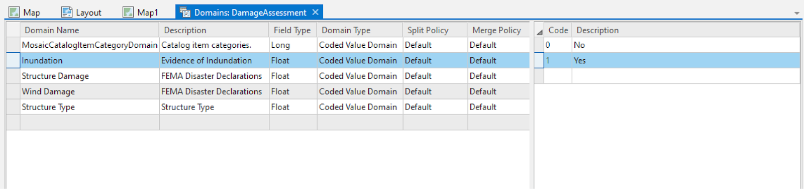
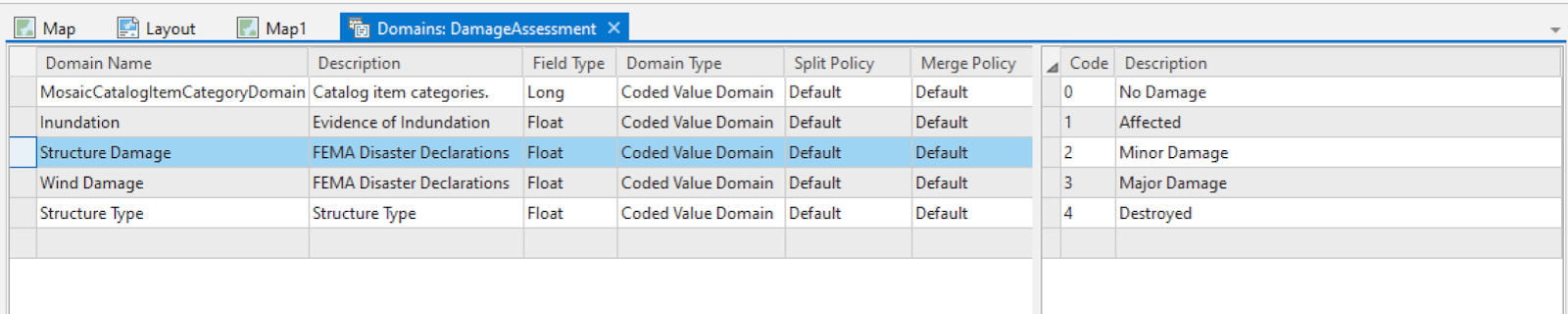
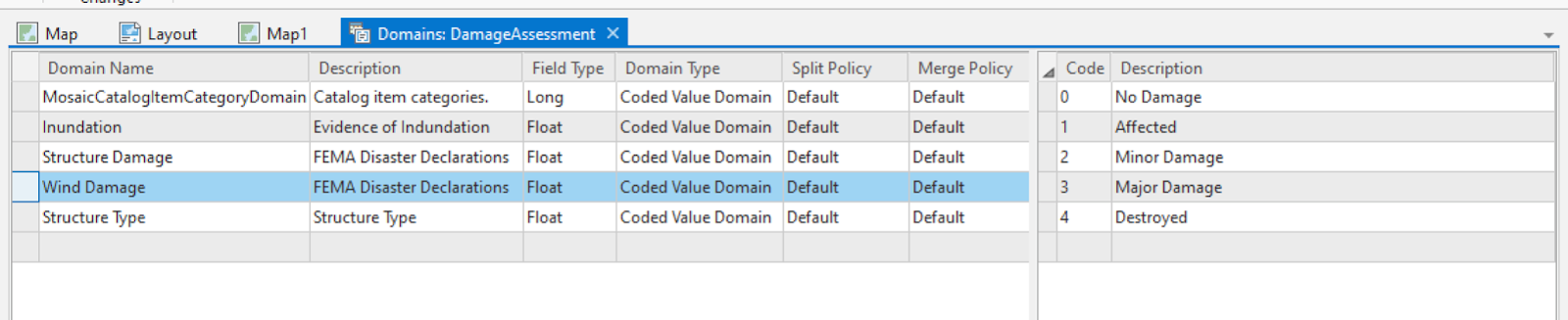
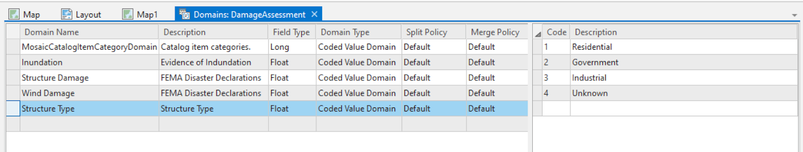
To simplify my analysis, I created domains with coordinating codes/descriptions that could be use to plot damage points quickly. These domains were created in the project geodatabase and the coding was used to map the numerical data with qualitative data.
Below are the domains I created and their descriptions.
In identifying properties, I used the swipe tool to quickly navigate to the building before the after the storm. I would then locate notable characteristics that would aid in classifying the structure under what type it is (i.e. residential, business, etc.). In determining damage assessment, I looked at how the building compared from post storm to pre-storm, looking for signs of damage like missing shingles, changes in coloration, and even if the whole building had shifted areas. The scale of 1:413 proved to be the best scale in identifying properties. Decisions that were most difficult were when the properties looked drastically different in the pre vs post storm files, but no evident damage could be seen, making it hard to classify the change in the attribute table. More information would definitely have been useful in this analysis, such as data collected in the field, as it would be more accurate than viewing the buildings from above. Also, if the bands were the same from pre to post storm files, it would be easier to make comparisons on the buildings from the different time periods as there would be less changes among them in the imagery. To digitize where the coastline was (where the water met land from an aerial perspective), I created a polyline using the cursor as a guide and following the water. After saving this newly created line, I used it as an input in the Multiline Buffer tool, which generated three separate buffers. Then, I ran a join to determine the join_count of buildings within each buffer zone. I then input the building counts into the table by what type of damage they incurred from Hurricane Sandy.
 |
| Assigned Symbolized Structure Damage Points |
Final Results
This analysis could certainly be set up for use within ArcGIS Collector. One would have the ability to collect the data in-situ and upload it directly from the field. This may prove to be more accurate, as a first-hand look at the actual damage may be more effective than looking at the structures from above. Once the data is collected in the field, it could be added to the map in a similar fashion as the lab assignment and the lab could be carried on as normal. Upon completing the table and assessing the variations in symbology, it is clear that structures closer to the coastline faced more structural damage. I would not say that the findings should be extrapolated to nearby areas, because there are a multitude of factors that impact structural damage, and the analysis was likely not entirely accurate. Tidal changes will impact the coastlines distance to structures, as well as variations in beach width and how far back structures are placed. Along with these factors, natural barriers like dunes and trees may decrease damage in certain areas.